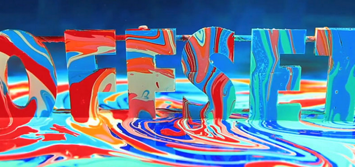
You may or may not know about Offset, chances are probably not.
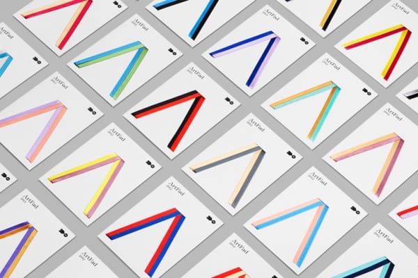
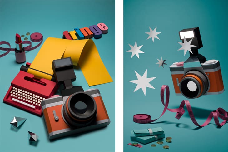
It is Ireland’s annual conference for the creative industry. It is a three day event in Dublin’s amazing Bord Gais Theatre where designers, photographers, illustrators and pretty much anyone involved in the creative fields come together to listen to our heroes and anti heroes ‘show and tell‘ for approximately a combined 50 hours, over 2 stages with about 2500 attendees.
This was my 5th time going to Offset, and I’ll tell you a secret, I was giddy like a child at Christmas about it!
So, as I am a fan of lists, I’d like to share some of the things that I learnt last weekend (in no particular order!):
1. Everything that we do has a reason
There were loads of quotes floating about from the speakers, my favourite was a lovely one from Hey Studio, a Spanish design studio; “Design helps illustrate complex content in a friendly manner“.
I thought it was a really nice way of saying a lot of what we do as designers – we take the complicated, and we create something approachable and digestible for our clients.
Its not all about pretty pictures and swanky fonts, everything that we do has a reason. Its considered and crafted and deliberately shaped as a solution to a situation.
2. I hate “Artists” waxing too lyrical ..
Early on one of the days a photographer spoke with passion and conviction about a series of images that he had taken, as both commercial and personal work. He bored the pants off me!
I’d rather that he’d shown us the work with 45 minutes of Metallica playing at nose-bleed inducing volumes than yack on about “his vision and the importance of the timeline in a coherent structure to illustrate the inner struggle of blah blah blah“. And its a shame, because the work was lovely.
I adore illustrators work, I wish I had their talents and their abilities to think at speed and with insane deadlines (frequently more insane than ours!) and listening to them explain the what and the how about their work was the most genuine and honest communication that I heard all week end. It blew the socks off the BS that others were spouting!
3. Music for my cremation
James Murphy (Ex LCD Sound System & DFA boss) can do no wrong. The man has made 400+ hours of music from tennis data. Click here and listen to this !! .. I want him to DJ at my cremation.
4. Some of us are good at communicating on one medium only
Sometimes the creator of incredible bodies of communicative works are terrible communicators. Ian Anderson of TDR, a studio that I would hold in very very high esteem from the past 20/25 years of incredible design was one of those people. Perhaps he was tired & emotional. Perhaps not.
5. Fuzion are starting a band
I need to start a band with the people in Fuzion. It would make our presentations a hell of a lot better and I’d get to curse even more than usual. If you are not of an easily-offended-nature, then click and watch Snask in action. Amazing stuff, brilliant work, they nailed the presentation and I want to go drinking with them.
6. Its good to Ask!
Ask. Ask if you can have a job. Ask if you can do a job. Ask if you can help. What’s the worse that can happen? They say “no“? There’s a very talented woman from Cobh, Co. Cork working in an amazing agency in New York because she asked.
Ask us.. Is there something that we can do for you? You might be surprised.
7. Picking our least favourite option
Clients, including famous/celebrity/creative clients will ALWAYS pick the option that you like the least. Its the law.
8. There are 8000 holes in the London Olympic Torch.
Each of these holes represents one of the 8000 runners in the torch relay. And if you were really quick after the Olympics had finished, you could have snapped one up on eBay for £150,000+. If you hold out though, there’s one up on eBay at the moment for about £4,500, a steal! (well there are 8,000 of them, so it’s not the most exclusive item on eBay).
There are also butane gas lighters that you can get for about a fiver, plus delivery. But they might explode (an example of less than perfect design).
9. Designers not Computers
Matt Willey is an extraordinary magazine designer. Truly, incredible layouts and a gift for making things read well on the page. And he moves things about even more than I do to find the perfect positioning for items.
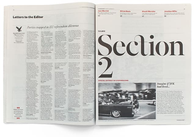 We take our time while designing because, contrary to popular belief, its not the computer putting things in the right place, its us – the designers. And on an average A4 page that’s 297 x 210mm or a spread that’s 297 x 420 there’s a hell of a lot of places you can position something.
But I am the designer, not the computer. I take pride in the things I do, and the crafts that I employ. Matt Willey confirmed that the consideration that designers take is both justified and necessary!
10. Kerning is important.
Kerning is the altering of space between two letterforms or characters in typesetting – now you know!
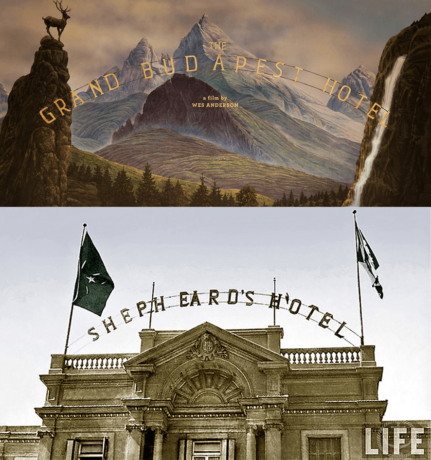
So little of what we as designers comes from nothing. Annie Atkins, the incredibly talented designer behind the graphics from the Grand Budapest Hotel, Wes Anderson’s beautiful movie – showed us so much of her work, explaining where it had come from and the inspiration behind it.
The work took months, largely hand done and repeatedly so for continuity in the movie, and continued past the shoot right into post-production where 3000+ pink Mendl’s boxes had to be digitally retouched, which brings me back to kerning.
While Atkins’ design was praised universally, the poster was questioned as to why the letter spacing was uneven. Look again at the hotel sign from the image above – the spaces between GRA—ND BUD–APEST HO–T–EL are all over the place, and she produced a research shot from a north African hotel sign from the 1930’s – Research influencing the design and kerning of course!
Its 13 months until the next event, and I cannot wait.
www.Iloveoffset.com ..I really do!


