When a few weeks ago I was asked to write another post for the Fuzion blog the Winter Olympic Games 2014 in Sochi were just about to kick off.
As an avid winter sports enthusiast (I grew up in a town in southern Poland that is surrounded by mountains and where the snow usually stays on the slopes for the better part of 6 months) I was looking forward to watching the broadcasts of the various events and competitions and rooting for the Polish athletes, two of whom I actually know personally.
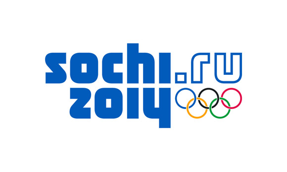
As a designer, however, there was another element of the games that sparked my interest long before the Games even started – namely the Sochi2014.ru identity, which I unfortunately found to be quite bland, rather dated (Soviet?) looking and lacking the usual flair and expressiveness traits that are traditionally associated with Olympic logos.
Judging by the amount of commentary on this topic, I wasn’t the only one who was, let’s say, “disappointed” by the Sochi identity.
All the hype around the Sochi logo got me thinking – what must have happened behind the scenes that directed a no doubt amazingly creative, talented and experienced team of designers to produce an identity for one of the most prestigious and important sporting events in the world that was just “meh”?
In an article for the New York Times, Jonathan Kolatch gave a very interesting summary of the design process for the Sochi 2014 Winter Olympics Logo and gave me the fuel to write this post.
According to the article “the design team from the Interbrand Agency originally had a much more sophisticated idea in mind”
However, this design approach was not what the Olympics Organizing Committee had in mind. What they favoured was a “more future-oriented” logo, and thus began what appears to have been a frustrating period of compromise with the various layers of Olympic bureaucracy, including the local Russian government, the International Olympic Committee (IOC), the Organizing Committee, marketing specialists, famous athletes, and probably many more…
Having read that, everything started to make sense!
What I realized was that, in short, what the team from Interbrand were faced with was a classic example of “Design by Committee”, which also happens to be synonymous with a “Designer’s Worst Nightmare”…
Design by committee is a phrase coined to describe a collaborative approach to design and, as I have experienced way too many times in my not-so-long career, is bound to produce suboptimal results.
It is also best described by the maxim “A camel looks like a horse that was planned by a committee”, although I think my favourite phrase is “a committee is a cul-de-sac into which ideas are lured and then quietly strangled”. All of these statements are, of course, saying the same thing: When there are too many cooks in the kitchen all you get is a mess!
As you can imagine, design-by-committee is one of the most frustrating and annoying aspects of a designer’s job because opinions can range widely, even within the smallest of groups and, usually, clients give way to personal preference instead of logical business, marketing, or design principles.
With so many people flashing thumbs up or thumbs down on a design, it often becomes impossible to trace the original rationale for a finished design and we end up with just a pretty picture with no soul.
Although it is the designer’s job to take the needs and goals of the customer into consideration, the opinions/beliefs of the “committee” are actually what get in the way of that. More often than not, the “committee” takes over the design process and believes that the “thinking” is their part and the designer’s only responsibility is execution.
I could probably go on about this for a very long time, however, what I have also learned in my not-so-long design career, is that there is no definitive solution to this problem and the best possible and most sensible answer is to listen, absorb, discuss, be able to defend any design decision with clarity and reason and, most importantly, know when to pick your battles and know when to let go.
Design-by-committee might be frustrating but it is also something that brings a new story and a new experience every day…isn’t that one of the great things about this business?
Basia
 Basia Kozlik is a Graphic Designer with Fuzion
Fuzion offer a full range of Graphic Design services from our Cork and Dublin office in Ireland including Branding, Logo Design, Marketing Materials and design for all digital channels.


